Annotomy
Annotomy
Annotomy is Duke-NUS Medical School's very own interactive 3D anatomy explorer and visualizer. Using the school's internal resource library of real-life anatomical assets donated by deceased individuals for the purposes of medical education and research. With Annotomy, students can access these resources without the need for physical specimen handling, enabling flexible, on-demand learning anytime and anywhere.
As part of my internship, a fellow intern and I were tasked to take on the design revamp of the original Annotomy website.
Market Research
Log In

Why Login Screen Matters?
Leaves a strong first impression (Users form an opinion about a website in 0.05 seconds)
Enhances UX
Reflects brand identity
Provides smooth error handling
Promotes personalized user interactions
Fields
There is varying positions (left, right, middle) fields can be placed. Left and Right placements are usually paired with an image/visuals on the opposite side. This makes the screen look less ‘empty’ and gives opportunity to promote branding/features. Right placement is more intuitive for mouse users, while Middle placement would translate better in responsive designs.

Industry standards for the placeholder text in the field varies but is usually ‘Username’ and ‘Password’ for both Username and Password fields respectively.
Variations include example input such as ‘e.g abc@gmail.com’ for username/email and ‘********’ for password.
Icons are also used to represent the fields.
Fields Labels
Some designs do not have field labels on the top of the field, and use icons and placeholder text within the field itself. This makes the interface ‘cleaner’ but might affect accessibility.

Features
Remember me (as a checkbox)
Forgot password (as a link/button)
Password toggle (as an icon button)
Clear page title with accompanying instructions (if applicable)

Error Message
Some websites choose to display the error message pop up box at the top, while some choose to place it underneath a field. The affected field usually has a red stroke outline. The dialogue should state the specific error clearly and provide solutions to rectify.

Best Practices - Error Messages
A research study shows that:
Displaying error messages at the top increases cognitive load on user memory.
Displaying error messages inline results in users correcting their errors faster.
Recognition rather than recall.
Another study found that:
“The distance between the erroneous field and error message influences the efficiency of error correction”
Top and bottom form validation resulted in the longest time for users to rectify errors, highest error rates and least user satisfaction.
Bottom of form validation had the lowest error correction rate.
Users in the study rated Right placement of error messages to be the most intuitive placement.
Why? The English language reads from left to right, so by placing the error message on the right, it follows the natural eye movement when reading.
For mobile designs though, due to the lack of space, error messages should be placed below the field.

If going for error message pop-up boxes (top and bottom of form), there should be a way to close it. Usually in the form of a ‘X’ button on the upper right hand corner. (User Control and Freedom)
Error Icons:

Error Color:

Best Practices - Layout
Keep the layout simple to avoid friction
Clear containers for information, minimal input fields, and straightforward instructions
Avoid lengthy, bloated text instructions at the top of the login interface
Use of spacing and grouping related elements

Best Practices - Visual Hierarchy
Distinct and obvious title/header
Good use of font size/weight/colour
Primary “sign in” button is prominent and distinctly colored
Secondary actions use less prominent styling
Clear spacing between different action types
Logical placement of buttons where users expect them

Best Practices - Buttons
Use related and appropriate button labels (‘Log In’ instead of ‘Continue’)
Provide feedback with button hover states
Use different styling for primary and secondary action buttons
Make buttons look like buttons
Primary and secondary buttons should look different
Buttons are not links. Buttons initiate action, Links are for navigation
Place primary actions where users finish their task
Avoid floating or disconnected buttons
Button wording needs to build confidence

Best Practices - Accessibility
Colour and Contrast: WCAG 2.0 level AA requires a contrast ratio of at least 4.5:1 for normal text and 3:1 for large text. WCAG 2.1 requires a contrast ratio of at least 3:1 for graphics and user interface components (such as form input borders). WCAG Level AAA requires a contrast ratio of at least 7:1 for normal text and 4.5:1 for large text.
Text Hierarchy and Readability: Ensure text size and spacing are conducive to readability.
Keyboard Navigation: Ensure that the login process can be navigated using a keyboard.
Simple and Clear Instructions: Use straightforward language for instructions and error messages. Avoid jargon or complex terms that might confuse users.

Suggested Changes - Login
Add some graphics to represent school branding
Replace fields placeholder text with ‘Username’ and ‘Password’ respectively
Improve text hierarchy
Consider right placement of error messages for specific fields
Red outline for affected field
Replace ‘Log In’ button with one that has a higher colour contrast
Email > Link
‘Change Password’ link > button
User Management List

Best Practices - Lists
Supporting visuals: Draws attention to the list item, helping to convey basic information about the item to your users
Primary text: Main text element, represents the most important piece of information for your users
Hierarchy through color and font: Use color and font variations to display hierarchy and minimize UI design clutter
Indented separators: List items will be closer together, so use indented separators for a less cluttered but easily comparable list of items
Filtering and sorting: Search filtering works well and does not take up much space

Best Practices - Scrollbar
Have the most important information above the fold
Avoid having both vertical and horizontal scrolling unless on a map
Consider adding a “jump to top” button
Avoid horizontal scrolling unless it’s part of the experience
Avoid double scroll *(excusable on desktop but not on mobile)

Best Practices - Forms
Minimize the number of fields where possible
Clearly mark optional fields
Keep key constraints top of mind (Technical, User and Business needs)
Group fields logically
Use a one-column layout
Place labels above form elements, not to the left of them
Label fields clearly and concisely
Use descriptive, action-based words on buttons
Don’t use placeholder text as labels
Don’t use all-uppercase in labels or placeholder text
Use confirmation messages where appropriate
Use success states
Use a sans-serif typeface with a high x-height
Disable the “Next” or “Submit” button until validation is passed

Suggested Changes - Admin Mode: User Management List
Distinguish Primary buttons from Secondary buttons through visual styling
Reduce form field header font size
Grouping of related fields
Clearer button titles
More spacing between elements in the User List
Higher colour contrast for breadcrumb link and filter button
Visual feedback for actions like selecting a user, button hover, success states
Form title changes dynamically based on context
3D Model Viewer

Website 1: Innerbody (Anatomy Explorer provided by Biodigital)
Innerbody provides an Anatomy Explorer with 12 major anatomy systems. The explorer provides two types of views: 2D Interactive and 3D Rotate and Zoom.

Note: For the purpose of accurate comparison, only the 3D Rotate and Zoom view will be used for this research.
Innerbody’s Advantages:
Mouse Rotation Speed
The speed at which the model rotates is relatively slower as compared to Annotomy. This provides better control for users to view desired areas with more caution without the worry of overshooting too much, or being unable to control how far or little it rotates.
Annotations
By directly connecting annotations to the body part instead of an annotation point, users will be able to better understand which exact part is the annotation referring to, especially if there are multiple overlapping, small parts. Additionally, a form of highlighting the body part when selected provides users with better and much more accurate visual feedback. NOTE: As the model provided by Innerbody is a digital replica of the human body, these capabilities are possible for the anatomy visualizer. As compared to Annotomy which uses 3D scans of existing real-life body parts, these annotation capabilities are not possible and are purely meant for reference and learning purposes.
Lastly, clicking on the part itself again or clicking outside of the anatomy model closes the annotation, providing more freedom of closing the annotation instead of a specific button within the box.

Annotomy’s Advantages:
Half Body View
Innerbody’s anatomy systems are presented as a full body instead of Annotomy’s presentation as different sections of the body in halves. Users may encounter difficulties in viewing specific desired parts, especially those that are very hidden or small within the body.
Additionally, Innerbody’s zooming system does not allow the user to zoom through the body.

Clarity of Instructions
In Annotomy, the annotation points are clear instructions of how to open the annotations for the specified part. However, in Innerbody, users are not told that they can click on the part directly for the annotations. This lack of clarity may cause users to experience a slower learning curve on how to use the program.
Multiple Annotations at once
In Annotomy, multiple annotations can remain opened at once after clicking on the annotation point. However, in Innerbody, only 1 annotation can be opened at any time. As users may require multiple annotations to remain on-screen for education purposes, this may present as a frustrating or inconvenient issue.
Website 2: Zygote Body
Zygote Body is a 3D anatomy online visualizer that provides 8 layers worth of anatomical visuals.

Zygote Body’s Advantages:
Similar Advantages with Innerbody
Mouse Rotation Speed: The speed of rotation is also relatively slower than Annotomy, allowing for better control and ease of usage.
Annotation Attachment: Similar to Innerbody, the annotations are connected to the body part itself and upon re-clicking, closes the annotation. This allows users to better pinpoint the exact body part that was selected.
Multiple Annotations
If a user wants any annotation to stay on screen, they can press the ‘pin’ button to make sure it does not close upon clicking other body parts, similar to Annotomy.
When comparing it to Annotomy, Zygote does take an extra click to make sure that the annotations that users want to keep, stays on-screen. However, if there are annotations that the user does not need in Annotomy, they would have to take an extra click as well to close it. Hence, this pointer would be both an advantage and disadvantage.

Annotomy’s Advantages:
Movement Limitations of Zygote Body
In Zygote Body, users are not able to rotate up or down with the mouse. It can only be done using the arrow buttons provided on the interface. Additionally, users are not able to pan the model to the left or right.
Users may not be able to view the model in angles that they may need to better analyze certain, more hidden parts of the body, thus possibly causing inconvenience and reduction of ease of usage.

Opacity Slider
Zygote Body offers a slider to reveal different layers of the body where required (starts from the skin surface, down to revealing the muscular system, to skeletal, etc.) While this could allow for an ease of switching between different systems, users may also struggle to stop at the correct amount of opacity to view the body part that they may be looking for.

Website 3: Visible Body
Visible Body is a subscription-based application consisting of a collection of interactive 3D anatomy and life science visualization tools.

Due to the vast capabilities and feature differences between Visible Body and Annotomy, the research and comparison between the two applications are limited.
Visible Body’s Advantages:
Description
Upon clicking on a body part, instead of an annotation appearing, a side window opens up with the name of the body part, including many other different feature buttons (e.g. Learn More, Model Orientation, etc.) NOTE: This is not within the scope of Annotomy, and is mainly for reference and learning purpose.

Annotomy’s Advantages:
Annotation
To make annotations appear for the selected body part, the user has to click on “Add Tag”, and an annotation will appear and remain on-screen until the user closes it via the ‘X’ button.
Similar to Zygote Body, making the annotation appear and remain on-screen takes an additional click as well. However, the only way to close these annotations is similar to Annotomy’s ‘X’ button. Thus, this may be more restrictive than Annotomy, or any other application in this market research.

Suggested Changes - 3D Model Viewer
After analyzing 3 different applications, this section will talk about features or changes that can be considered for Annotomy to improve the UX of the application.
Mouse Rotation Speed
As learned from the 3 applications, Annotomy’s mouse rotation speed could be improved by reducing its speed to allow for better and more precise control, and an ease of usage for users.
Closing Annotations
Depending on the capability of Unity, Annotomy may implement the ability to close annotations by clicking outside of the model. This prevents users from feeling restricted to only close annotations via an ‘X’ button.
Pinning Multiple Annotations
Annotomy may consider adopting the Pin feature to pin annotations that users want to keep on-screen. As mentioned in reference to Zygote Body’s anatomy visualizer, while it does take an extra click to pin annotations, Annotomy users do also take an extra click to close annotations that they do not want, instead of being able to close it when another annotation point is clicked. Hence, while this may be both an advantage and disadvantage, the option of having the Pin feature could offer users more flexibility in customizing their experience.
Tags Management

Website 1: Jira
A project management tool
Uses ‘labels’ instead of ‘tags’ (but function the same, only different naming)
Ability to add tags to specific tasks
Ability to make new tags and shows recently used tags
Ability to search/filter for tasks that have a specified tag using their advanced search function
Assigning, Adding, Search Tags/Labels

Insights
Streamlined process of assigning labels, adding labels and searching by label
Multiple actions (adding, searching for and making labels) can be done in one interface
Additional useful features like searching by label and having a dedicated search bar for labels only
Labels are presented in a scrollable list, with suggestions of recent labels separated from all labels
Adding a new label is extremely easy, by just typing it and it is auto created
All the labels are of the same size and font, making it readable
Hover states for each label button
Unassigning a label is as easy as just clicking the ‘X’ button for that label
Website 2: Jobstreet
A job-searching website
Uses ‘skills’ instead of tags (with the same functionality)
Ability to search for tags to add to portfolio
If the tag does not exist in their database, it can be made and added as a new tag
Ability to show suggested tags based on your career history
Assigning Tags/Skills
To add a skill to the portfolio, users will have to click “Add Skills”, and a side window with the title, “Edit Skills” will appear.
In the “Edit Skills” window, users can:
Add existing skill
Make a new skill
Add a suggested skill
Remove any added skill


Insights
In the case of many existing tags in the database, users will be able to simply search and find their desired tag from a dropdown, scrollable list.
If users wish to create their own unique tags, they can do so in the same search bar if it cannot be found within the database.
If users wish to remove any tag, they can simply remove it by an ‘X’ button, as compared to selecting the desired tag, and removing it from the annotation with an additional arrow button.
(If wish to be implemented) Users can also added suggested tags relevant to the desired annotation.
Suggested Changes - Tag Management
Use a scrollable list for tags and place them vertically instead of horizontally
Combine similar functions into one interface
Assign tags from a scrollable, dropdown list
Unassign tags via a close/’X’ button
Create new tags if it does not exist within database
Display recently used/suggested tags
Ability to show annotations (belonging to the model) of a tag by clicking on the tag itself
Hover states for each tag button
Visual Guide
Logo Colours

UI Style References

3D Model Viewer References - Translation / Rotation / Zoom


3D Model Viewer References - Annotation


Viewer/Editor Main Page Reference - Table

Viewer/Editor Main Page - Card List

Fonts
Final Prototype went with Atkinson Hyperlegible to allow for maximum comprehension for all readers with different levels of readability.


Ideation Progress
All designs were created within Figma.
Login Page Designs


Model Menu
List View Versions:


Card View Version:

Different Types of Card Designs:

3D Model Viewer


3D Model Editor

After many iterations and meetings with our supervisor and seniors involved in the project, Annotomy has evolved to its final desirable design as shown in the gallery or down below.
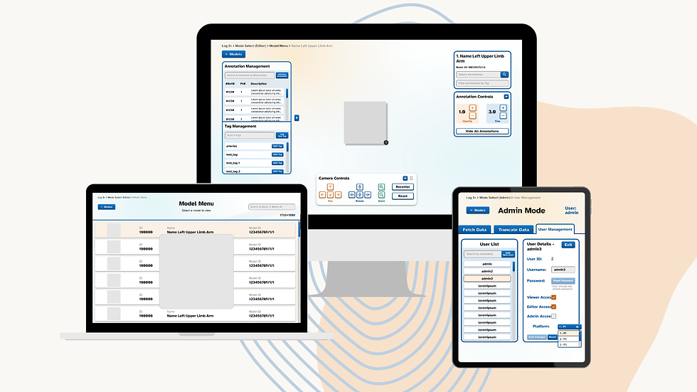
AFTER DESIGN
During the designing period, I was then tasked to implement the Figma design into its Unity Engine project for an estimated period of 2 months.
DISCLAIMER: As part of the Non-Disclosure Agreement signed with Duke-NUS Medical School, the actual Unity or Figma prototype is not allowed to be shared. Additionally, the contents with the Unity prototype contains many instances of confidential information and thus is not shown. Below are image screenshots of the Figma prototype with appropriate redaction of any confidential information to allow for this content to be on this website.


The Process, The Research


Role
UI/UX Designer, UI Unity Implementation
Tags
Collaboration, UX/UI
ABOUT
Annotomy is Duke-NUS Medical School's very own interactive 3D anatomy explorer and visualizer. Using the school's internal resource library of real-life anatomical assets donated by deceased individuals for the purposes of medical education and research. With Annotomy, students can access these resources without the need for physical specimen handling, enabling flexible, on-demand learning anytime and anywhere.