
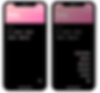
Daylist
CHOSEN PRODUCT

App Link: DAYLIST
Made by Buddy Budgeting, Daylist is a To-do list mobile application made to better assist users in keeping track of their to-dos, categorize them, and provide sound reminders if required as well.
Market Research: Is there a demand for To-Do Lists?
Research done by Ellen Damaschino at Microsoft reported that U.S. users have the highest dependency on to-do lists worldwide, with more than 76% of respondents using at least one list at the time of this survey. More than 73% of respondents feedbacked that to-do lists act as stress management tools and tend to have a calming effect on them. Respondents in Canada have the highest percentage of users who keep at least one list with more than 78%, whilst Japan has the lowest percentage with 54% (Damaschino, 2008). Nonetheless, with the increasing usage of modern technology, the demand for better organization ways is only increasing, especially after the 2020 COVID-19 pandemic.
Challenges Faced
1. Redesign
This project was initially started to be an improvement of the application. After navigating and familiarizing with the original Daylist application, it was quite surprising to find how limited the functions within the application currently provide, and the lack of modernity or trendiness in terms of the UI design. As a result, there needed to be a redefinition of the project to properly point the project in the direction of an application redesign instead. To add on, this led to a need to redesign the application's logo, create a proper colour palette and typography definition, and design a UI concept from scratch.
2. Competitors
There were many competitor applications within the same genre of Daylist. This caused many complications when considering new and/or unique functionalities that could compete against said competitors. To add on, as mentioned earlier, with how limited the current application provided, it was especially difficult to update and create new functions without simply creating a whole new application in itself. Hence, much more time and effort were put into considering what should and should not be hadded to the revamped application.
Competitor Analysis
To gain a better insight on the application’s capability to compete with others in the same market, it is required to study and analyze some of the top potential competitors.
Microsoft To-Do
As an application under Microsoft, Microsoft To-Do allows users to sync their to-do lists across devices and Microsoft 365 accounts to provide access to them anywhere and everywhere. They also offer multiple features along with their to-do lists, such as the File Attachment capability of up to 25MB and recurring reminders and due dates to keep users on task.
Todoist
Todoist supports group collaboration within a to-do list to elevate project productivity and keep the group on track. They also offer a visual Goal Tracking feature to motivate users to complete their tasks and meet goals by the end of each day. To top it off, Todoist provides Location-based reminders to provide notification reminders for users when they’ve arrived at the specified location.
Structured
Structured provides an amazing visual timeline for each day, providing users with a clear outline of their day without the worry of overlooking a task or deadline to be done or completed within the day. Additionally, they provide an Inbox to capture tasks for the moment, for users to sort out their tasks timeline afterwards.
User Requirement List
The user requirement list will provide us with better visualization on identifying the needs and requirements of to-do list users when deciding what to put on their to-do list.

User Story
With the user requirement list and our target audience identified, we are able to craft user stories to create scenarios of potential needs and requirements that the application will be able to solve for our users.

Heuristic Evaluation
After evaluating the application, several issues have been identified that may require immediate adaptations.
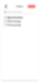
Button Inefficiency
There are multiple features in the application that have multiple buttons linked to it. This clutters the application unnecessarily where more features could have been added instead. This can be seen for features: Add list and Navigate to Previous/Next day.
For instance, to add a list for the day, you can either press the “+” button below “ADD LIST”, or open the floating “...” button on the bottom-right and press “Add list”.

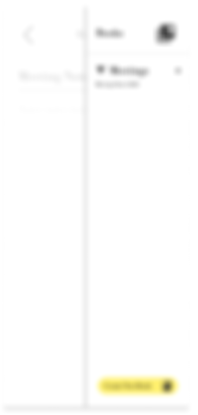
Missing Micro-Features
The application currently has some micro-features required that are not present. Micro-features here are defined as small buttons that are required to greatly improve the user experience (e.g. Hide, Add, Undo)
For instance, to delete a whole to-do list with 1 or more tasks, you are required to remove every task, before you can delete the to-do list itself. Another instance is that there is currently no micro-feature to hide completed tasks for specific to-do list(s).

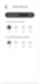
Extra Steps
The application is designed in a way that some features requires 1 or more extra button clicks to navigate. This makes the usage of the application unnecessarily busy where it could have been simplified in many ways instead.
For example, to add more than 1 task under a to-do list, you need to press the “+” button at the side of the to-do list. This experience could have been improved by automatically display a translucent new task below the last task. Thus, users do not need to press an additional button and is able to create a new task easily.
Personas & User Journeys
Multiple personas were created along with their user journeys. However, for the sake of the respective personas' privacies, they will not be presented within this portfolio post.
Design Goals
Smooth and Easy - To provide a smooth and pleasant experience while users navigate through the application, the design aims to revamp the overall layout simplistically and straightforwardly.
Realistic - Preserving the idea of note-taking and to-do lists in mind, the design aims to mimic a similar and realistic style like traditional pen and paper while keeping a modernized take to it.
Realistic - To allow users to feel like these lists and notes are truly their creations, the design aims to provide a more personalized experience throughout.
Not Just a To-do List - A common missed opportunity in many to-do list applications is that it tends to serve the sole purpose of a to-do list and nothing else. Thus, the revamped design aims to include more features that are relative to noting.
Low-Fidelity Prototype

1. Login & Create Account
The Login and Create Account functions were implemented to provide users access to the application contents on multiple devices. Hence, the application takes in very minimal information to create an account for the user. The user's email address is taken in to provide users with a way to retrieve or reset their password if required. To enhance the ease of logging in, users are provided the option to log in via social media accounts as well.

2. Homepage
The main objective while designing the homepage was to ensure that users could access or view different features within 1 to a maximum of 2 taps. Users can access different days’ Lists and Timelines via the 7-day bar or a calendar view.
The Today’s List view features and includes:
1. To-Do List - Creation of to-do list, Color and icon customization, Setting configuration (Priority, Difficulty, Due Date), Completion bar, Hide/Show list, Delete to-do list
2. To-do Tasks - Creation of to-do tasks under to-do lists, Color customization
3. Overall Completion Tracker - Completion tracking for the respective day and week
4. Filter - Order by (Priority, Difficulty, Time Added), Display/Hide completed lists
The Today’s Timeline view features and includes:
1. Schedule - Creation of schedule, Setting configuration (Reminder, Start and End time, Scheduled Date, Tagging with customized tags, Delete schedule
2. Tags - Creation of tags, colour customization of tagsSchedules that have ended or are before the current time are greyed out.
3. Taskbox
The taskbox feature provides a blank space for users to throw all their tasks in a box and sort them to specific days when needed. They can also clear the taskbox with a click of a button.
4. Bookshelf
The Bookshelf feature provides an open space for users to create “Books” to store note pages. Users can also clear the page with a click and delete or create more books and pages. It is especially helpful for users who may wish to refer to their books/notes relative to a task, list, or schedule.

5. Profile
The Profile feature provides users access to edit their account information, add a profile picture (optional), customize their Daylist (Main font, App colour theme), and log out of their account.
6. Sticker Collection
The Sticker Collection feature is a minor incentive feature that rewards users for their active usage of the application. The more they create, the more stickers they can collect to use as their to-do list icons.
Style Guide
App Concept & Logo
The application was revamped to don a “Diary-like” concept because the original app did not have a concept in terms of its design and mainly just looked like an application that housed a bunch of default text and buttons. With the “Diary-like” concept, the icon was redesigned to include the application name in a handwritten font, along with the 3 bars symbolizing the multiple days and lists created.

Color Palette
With the idea of a diary in mind, the chosen colour palette reflects a comforting and cosy Light Blue and Dark Brown, which are colours that are typically seen in productive and quiet places such as a Cafe or Library, while also keeping a sense of professionalism and cleanliness, like a book, with the chosen Grey and Black. The shade of white is also intended to imitate the creamy type of white that is typically seen in diary paper pages.
Typography
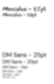
Due to its handwritten style following the "Diary-like" concept of the app, the font, Mansalva was chosen to serve the purpose of being the main title font within the application.
To allow users to be able to read the information quickly and easily, the clean and sleek-looking sans-serif font, DM Sans, was chosen to be used for non-title texts.

Iconography
To ensure enhanced readability and ease of understanding for users, commonly seen and simple UI icons were chosen. Icons that were added for list customization are excluded.

UI Kit
This section displays the UI elements that were implemented within the prototype. The elements were designed to be clean, simple, and easy to read.
A/B Usability Testing


High-Fidelity Prototype

1. Login & Create Account
Following the idea of a “Diary-like” concept, the Onboarding Page imitates the look of a professional notebook. Like most notebooks, there would be a “This Book belongs to: “ field to allow users to tag their name onto the book. Thus, the Login Page is inspired to take after this tradition to give app users the feeling that they truly own whatever they write in this application as well.

2. Homepage
The homepage dons a welcome text, “What’s happening today, writer?” to provide a more connected and personal experience for the user when they enter the application to add to-do lists and schedules.
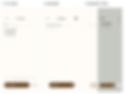
3. To-do Box & Bookshelf
The To-do Box, originally known as the Taskbox, and the Bookshelf both include a very simple and blank UI. This was intended to incorporate a “plain paper” concept for these pages to allow users to write more freely on them as much as they like.

4. Profile & Sticker Collection
The stickers that users can unlock within the Sticker Collection were intended to be more fun and bright, as compared to the default icons provided, which are black in colour. It was inspired by the idea of “scrapbooking”, which has been gaining popularity in recent years.
The Process, The Research


ABOUT
Made by Buddy Budgeting, Daylist is a To-do list mobile application made to better assist users in keeping track of their to-dos, categorize them, and provide sound reminders if required as well. This project researches into its respective market, analyses the app's weaknesses, dives into user research, all before moving into improving it through redesigning.