NP@Entry
Challenge Faced - Lack of Functions
For an application that only had 1 main feature, which is to allow NP students to scan the SafeEntry QR code, there would have been no point in creating a whole new application for it. Thus, there was a need to brainstorm mini functions that would have been useful for students to use apart from scanning the SafeEntry QR code.
Requirements
Problems & Requirements
The first common problem that users face while using the application is the
issue of being unable to scan and detect the SafeEntry QR code. Users have reported that they would take a lot more time just to scan the QR code as the application does not register it properly at times. Thus, the first requirement would be for users to be able to check-in without having to scan the QR code. As such, a function that detects the nearest SafeEntry check-in location is suggested to be added to the application. For this function to work, at each location, there will be a Bluetooth adapter. Users will no longer have to be worried about hogging the scanning queue when they can check-in beforehand as long as their Bluetooth is able to detect the Bluetooth adapter at the check-in location. This will also reduce users’ concerns of breach of privacy if phone location was used as this application is only supposed to be used in school. With this implementation, this allows for an enhanced ease of usage and convenience for the user experience.
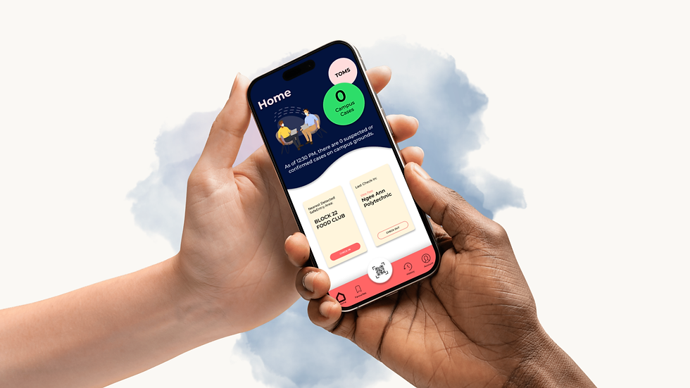
Another common problem that users face is that one of the only ways of receiving updates on any COVID-19 cases within campus is through email. As such, many users have feedbacked on the fact that they would miss these emails due to the fact that their mail would usually be spammed with other campus news that they do not find interest in. Thus, a second requirement for this application would be to allow users to have a counter on campus cases shown within the app. Not only will this be able to provide users with easier access to campus cases, it also allows for an easier updating of count for the person-in-charge of relaying these news. It is believed that this implementation will be able to attract users to use the application more often rather than only using it for checking in and checking out.
The last common problem that users have encountered is the fact that the only way to submit the Temperature Online Monitoring Systems (TOMS) declaration is by scanning the QR code at the front of the school or by having it saved as a bookmark in their web browser. As such, users have found that the submission is inconvenient as they would have to switch applications after showing the proof of submitting the TOMS form. Thus, another requirement would be to allow users to submit a TOMS declaration through the application. This can greatly increase the ease of submission and convenience for the users.
Secondary Requirements
In the case where a user needs to favourite locations, one of the secondary function requirements includes a Favourites page. This allows users to check-in to their desired location when their Bluetooth does not detect the Bluetooth adapter at the location. This adds as another check-in option other than scanning of QR code which in turn increases convenience and ease of usage of the application.
Some places require compulsory checking of SafeEntry Check-Out whereas some do not. Thus, a History page is required so as to allow the SafeEntry pass checkers to verify a user’s check-out even when they have exited the SafeEntry Check-Out page.
Lastly, in the case where a user has to verify their NP@Entry account information, an Account page that displays the user’s account details while censoring confidential information partially is made a requirement as well.
Information Architecture
Analysis of Existing SafeEntry Application
The application uses Global Navigation for their navigation bar. This allows them to ensure a persistent navigation design and allows the users to be aware of the pages that they are on by filling the icons on the respective pages.
The application also makes use of the Springboard Layout as their Mobile Navigation pattern for the home page. It allows the application to provide the user with a quick overview of the important contents of the application.
In terms of design and color scheme, the application makes use of the light blue colour which makes the application feel more friendly and inviting to use. It also uses the colour white for the main interface which allows the user to be drawn towards the colorful icons.
Additionally, the use of the colorful banner with people using the application and the function icons are a positive addition to the supposedly “health-related” app in terms of the use of creativity and design.
The application implemented the scanning of SafeEntry QR code alongside the health declaration together in one page. This can provide users with a simpler and quicker navigation from scanning to checking in. However, it should be noted that this can cause worry to the locals as people may overlook the health declaration and would not take it seriously. This in turn would increase the risk of someone that has contracted the Covid-19 virus to spread it in populated areas.
The implementation of a “How to use” is a beneficial addition to the page as it serves to help people that are not used to the application to learn how to use it.
In terms of color and font designs, the page achieves consistency with the same font and white text.
A different navigation bar is used for the scanning QR code page, favourites page, and the digital barcode page as it allows for different types of check-in methods. This could cause confusion to new users. However, the increased range of check-in methods reduces room for error in the case where one check-in method does not work for a particular place.
This page uses List as their mobile navigation pattern which is suitable as the information shown is lengthy.
Users are also given the option to check-in by searching for the SafeEntry location and remove a place from their favourites list. This can provide more freedom of customisation and allow for more solutions in times of errors for the user.
The page uses the colour white as the background for more emphasis on the information within the page itself. The yellow stars give the page more energy and make it less dull for the user experience.

This page uses List as their layout pattern as there was a need to display lengthy information. This allows for a more simplified viewing for the user as it makes it easier for them to read and understand the shown information.
The page uses the yellow stars and blue Bluetooth icons to give the plain white page more vibrancy.
The use of different font sizes and types allows the user to understand the information with more ease as it puts different types of emphasis on different types of information (e.g. bold for location, regular for time).

This page uses a list menu which allows the user to understand the navigation to the different settings for the application. However, as the information shown are not long titles or require any sub text, it loses the opportunity to give the application more colour and vibrancy which makes the page less interesting and more dull.
The font types and sizes remain consistent from the other pages which provides more ease of usage and improved recognition for the users.
Site Map

Personas
Student Persona
Name | Maybelle Quah |
Age | 18 |
Occupation/Status | Financial Hacker Intern |
Technical Expertise | Web Comfort Level: High Mobile Comfort Level: Medium Social Network Comfort Level: High Applications Used: Instagram, Telegram, Pinterest Software Used: Adobe Photoshop, Adobe Premiere Pro CC, Microsoft Excel, Microsoft Word UX Goals: easy to use, convenient, comfortable to view |
Behaviour | Critical Thinker, Perfectionist, Hardworking |
Likes | Aesthetic designs, ethical hacking (business), music & arts |
Dislikes | Studying, Photo Taking |
Influenced By | Friends, Mentors, Instagram, Pinterest, Tumblr, Shopee |
Personal Info - PICTURE OMITTED FOR PRIVACY REASONS - |
|
Staff Persona
Name | Mark Lee |
Age | 31 |
Occupation/Status | Film & Media Studies Lecturer |
Technical Expertise | Web Comfort Level: High Mobile Comfort Level: Medium Social Network Comfort Level: Medium Applications Used: YouTube, WhatsApp Software Used: Adobe Premiere Pro CC, Adobe Lightroom UX Goals: simple and easy, not too many functions |
Behaviour | Calm, Problem-Solver, Determined |
Likes | Creating (films and photoshoots), Coffee, Books, Travelling |
Dislikes | Studying, Dieting, Stage Performing |
Influenced By | Friends, Colleagues, Mentors, Instagram, Twitter |
Personal Info- PICTURE OMITTED FOR PRIVACY REASONS - |
|
Guest Persona
Name | Adriel Wong |
Age | 20 |
Occupation/Status | Lab Assistant |
Technical Expertise | Web Comfort Level: High Mobile Comfort Level: Medium Social Network Comfort Level: Medium Applications Used: YouTube, Twitch, Instagram Software Used: Audacity, UX Goals: quick and efficient, simple, aesthetic |
Behaviour | Independent, hardworking, focused learner |
Likes | Experiencing & learning new things, dancing |
Dislikes | Studying |
Influenced By | Friends, Teachers, Twitch, YouTube, Instagram |
Personal Info- PICTURE OMITTED FOR PRIVACY REASONS - |
|
User Journeys
Student Persona (A Day in The Life of Maybelle)

After the announcement of the application release, Maybelle downloaded NP@Entry from the App Store. On the first time opening the application, she will see the Welcome Page for Staff/Students. She enters her phone number and taps on “GET OTP”. She is then sent a One-Time Pin and fills up the OTP input section and taps on “CONFIRM”.

She is redirected to the Profile Registration Page where she is prompted to enter her school ID, password, NRIC Type and NRIC. On completion of filling up the form and clicking “NEXT”, a web browser pop-up to verify her SingPass comes up and she continues to complete the verification. After verification, the web browser pop-up closes and she presses “NEXT” again to be redirected to the next step.

She is then required to enable her Bluetooth, Camera and App Notifications. On clicking “ENABLE”, a system pop-up to enable the following permissions will appear and she clicks on Allow for the mentioned permissions. Immediately after, she is redirected to the Completion Page where she will be able to access the application’s Home Page.

The following day, on arriving at Ngee Ann Polytechnic, Maybelle is required to fill up her TOMS form. She opens up her application to click on the TOMS button instead of scanning the TOMS QR code at the school entrance. She fills up the form and shows the security guard the TOMS verification page. Without exiting the application, she closes the web browser pop-up and directly presses on “CHECK IN” below the “Nearest Detected SafeEntry Area location: Ngee Ann Polytechnic” text in the same page. She then reads, submits the health declaration, and shows the SafeEntry Pass Checker the SafeEntry Check-In Page. She goes back to the Home Page to notice that the Last Check-In has updated from “None” to “Ngee Ann Polytechnic”. Halfway through her walk to Block 22, she is approached by a staff member to verify her SafeEntry pass. She opens up the application again and clicks on View Pass in the Last Check-In box to show the staff her SafeEntry Check-In pass.

After confirming with the staff member, she decided to add the location to Favourites as she clicked on “Add to Favourites”. She goes back to the Home Page to navigate to the Favourites Page to check her addition and she sees that it was successfully added.

On reaching Block 22 Food Club, she notices her Bluetooth is unable to detect the SafeEntry location. She then taps on the QR Code Scanner icon in the navigation bar and aims at the QR code. She completes the health declaration and shows the staff at the Food Club entrance her SafeEntry Check-In Pass. On exiting, she opened the application, tapped on “CHECK OUT” below the “Last Check-In: BLK 22 FOOD CLUB” text, and showed the Food Club entrance staff member her SafeEntry Check-Out Page.
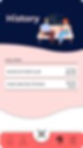
Once again, she is then stopped by a staff member to show them her History Page as they noticed that Maybelle went into Food Club. Maybelle opens her application and navigates to the History Page via the Navigation Bar and shows this page to the staff member. The staff member confirms and allows her leave.

Maybelle then found that she accidentally added Blk 22 Food Club to her Favourites when she does not visit the area often. She holds down the Blk 22 Food Club tag, selects it, and presses “DELETE”.
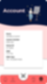
She enters class and her lecturer prompts for everyone to confirm their application download and that they used the right information to register. Maybelle opens the application and navigates to the Account Page to show her lecturer the proof of registration.
Principles of Design
Navigation Design & Layout
Global Navigation & Tab Menu


For the home page navigation, the use of global navigation and tab menu is implemented for the navigation bar. It allows for better user recognition as the same navigation bar is used throughout all the pages with regard to the type of registration they went through. For example, student/staff members will be using the Staff/Staff Navigation Bar throughout the application. This also allows for better consistency of design of the app.
Springboard Layout

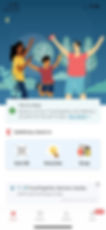
The use of the Springboard layout was implemented for the home pages. This allows for the display of important or main functions such as TOMS, check-in and check-out while also displaying the app’s design personality.
List Layout


The use of the List layout was implemented for some of the pages in the app. This allows the user to read the displayed information with more ease as they can be lengthy. The separation of respective information using the different boxes or bolded/regular pattern enhances the ease of understanding.
Efficient & Engaging
Efficiency


The registration pages shown verifies with two databases at once to minimise the number of steps that users would have to go through.
Users also only need to register once and the application will stick with the following profile as long as it is installed. This reduces the need to log in every single entry as the application will be used very often.
With the addition of TOMS in the application, students will no longer have to go through the process of opening both their web browser and their SafeEntry application when they can just use the NP@Entry application to complete both TOMS submission and SafeEntry check-in in the same place.
Engaging

For the background design, the use of Ngee Ann Polytechnic’s logo for the year colours, pink and blue, were implemented into the background. The shades were adjusted to match the current trends of dark mode and pastel colours in application usage. Drop shadows were added to make the colours look like they are dripping down or waving through the page. This adds more depth to the design and gives the application more vibrancy and personality as a “health-related” application.
The use of these images also add more colour to the application’s personality and fits into the concept of a school environment.
Visual Design
Contrast


Contrast was implemented for buttons that are opposite each other. As shown on the left, position buttons have a much higher contrast which allows the user to see a clear action to take as compared to if they were of the same colours which would have caused the buttons to be competing for the user’s attention.
Alignment


Lengthy information is typically aligned left throughout the information. According to an article, it is said that left aligned text is easier for reading than centered text for the same information or paragraphs. Without a straight left edge, there is no consistent place where users can move their eyes to when they complete reading each line.
Buttons are commonly aligned in the center as when users are reading the information, their path of reading usually goes from up to down. Thus, it would be easier to keep the user’s attention on the application if the flow is consistent.
Proximity


The use of two separated boxes for the check-in and check-out functions allows for better organization and suggests to the users that they are two groups with differences between them (Tubik Studio, 2017). It also enhances the readability and the speed of learning.
The separation of the QR code icon not only imitates the act of taking a picture, but it also enhances the difference in importance between the QR Code Scanner function and the other functions.
Colors

The color palette was used consistently throughout the application. Dark Blue was inspired as Ngee Ann Polytechnic’s official colour which also gives the application a modern but professional color. Light pink was inspired from the school’s logo this year while the coral red color was inspired from the SafeEntry logo. Red is known to symbolise alarm, youth and energy while light pink gives the application a youthful feel. White and black are typically used to support the other colors around them and draw more attention to the information presented.
Additionally, dark blue is used at the top as dark colors are able to attract attention more due to its contrast with the other colors. Thus, it allows us to arrange the information according with how the design is able to control the reader’s direction of attention.
Typography


The use of the oversized font is to be able to provide more emphasis and attention to the information. The consistent enlarged font for the page headers such as “Home” is able to attract the user’s reading attention to go from top down while also letting the reader know what the page is.
The montserrat font is the only font used for the application to ensure design persistency. It is also a type of Sans Serif font which most general users are comfortable with using due to its elegant simplicity, resulting in its common usage in posters, other applications, editorials, etc.
Space

The application design took into account in implementing appropriate white spaces in the pages. Page information is separated properly to reduce clutter which could invoke a feeling of displeasure in users. Simplistic images are also used in parts of the whitespaces to give colour while also ensuring space in the pages.
Conclusion
This report has completed its discussion on the improvement and changes made to better fit Ngee Ann Polytechnic in creating an application around SafeEntry through much research and the studying of design to create NP@Entry. It is with hope that this application design will be able to provide users with a more customised, comfortable, and convenient experience of using a SafeEntry application. It is also hoped that they will encounter lesser issues with the new and improved solutions implemented.
References
Anthony (2011, January 19). Why You Should Never Center Align Paragraph Text. Retrieved from: https://uxmovement.com/content/why-you-should-never-center-align-paragraph-text/
Tubik Studio (2019, November 13). Gestalt Theory for UX Design: Principle of Proximity. Retrieved from:
https://uxplanet.org/gestalt-theory-for-ux-design-principle-of-proximity-e56b136d52d1
The Process, The Research


ABOUT
NP@Entry is an application created from the collaboration of Ngee Ann Polytechnic and Ministry of Health Singapore. The purpose of this application is to enhance the SafeEntry contact tracing of Ngee Ann Polytechnic students and staff members. This will allow the organization to achieve a more accurate tracing without getting the users to do more than they already are. This application design was made with careful consideration to ensure ease of usage and convenience for users.
The application design includes functions such as the One-Time Registration, Automatic Campus Case Counter, Nearest Detected SafeEntry Check-In, QR Code Scanner, Safe-Entry Check-In & Check-Out, Favourites, History of Visit and Accounts Page.